

USER
INTERFACE DESIGN
Example: Enterprise application software
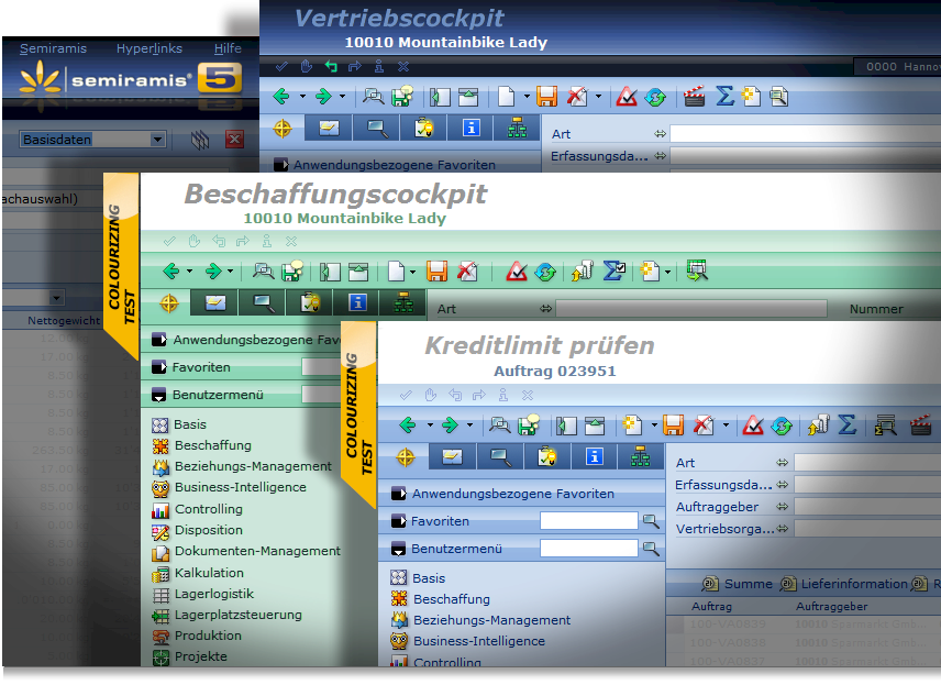
Above
you can see several layered screenshots of the "Semiramis" user
interface. The award-winning enterprise resource and planning software now distributed under the brand name "COMARCH ERP". This highly
ergonomic ERP software was designed for the internet and is successfully used by
numerous medium-sized companies like
Zalando, SONAX, Victorinox,
Blizzard,
Falke, the sportscar manufacturer
Wiesmann,
Develey, Freudenberg, Dallmayr, Kik, Bernbacher, and many more. Wolfgang Karner designed the entire user interface for this highly
ergonomic, "easy to learn" ERP-software - including thousands of integrated icons.

The focus is on the user
Almost
since decades Wolfgang Karner was successfully fighting for the
intuitiv user guidance. In the middle of the 90ies his brother's
software company started developing an ultra modern, one hundred
percent Java, browser-enabled enterprise application software. Wolfgang
Karner was asked to design the user interface. Without knowing much
about working with enterprise application software he quickly learned
how complicated and user-unfriendly this kind of software was and
mostly still is. So he started to focus on the needs of the user only -
not an expert's needs - he thought on a user without great
computing-skills. Against many odds from the software developer's side
he was able to convince the responsible to focus on the user's comfort.
Due to the low computing power of these years, the software's
performance was very poor in the beginning but finally the output was
perfect. Of course it took a lot of effort and commitment to finally
realize this revolutionary approach. Now the COMARCH ERP software and
especially its usability is awarded almost every year and is highly accepted by the users. It is so easy to work with this software and it is very easy to learn it aswell.


